
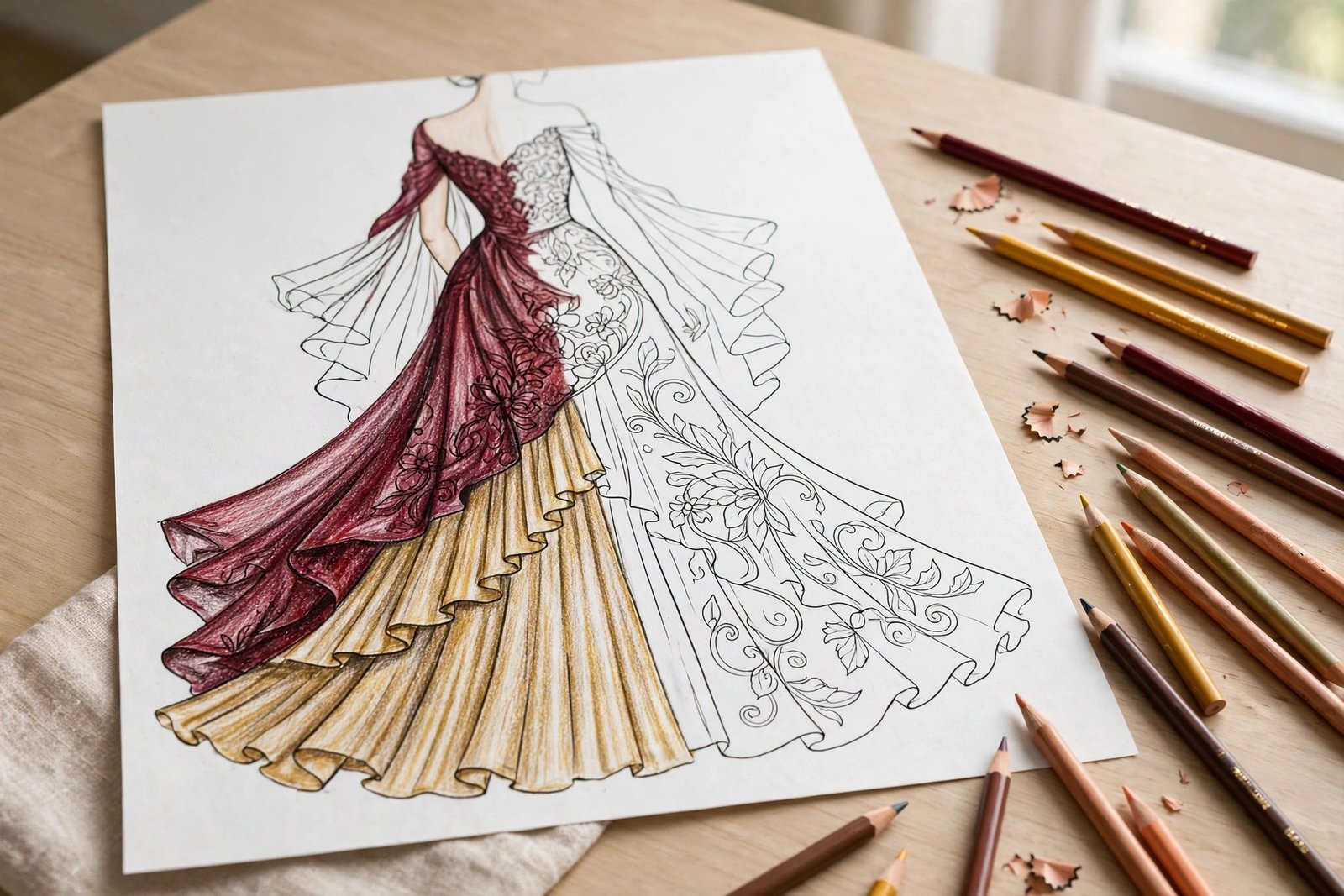
Fashion illustrations look intimidating at first glance. The models are elegant, the outfits are detailed, and every fold of fabric seems to demand a decision. But here is the good news: learning how to color fashion illustrations is mostly a matter of breaking the page into small, manageable parts — skin first, then fabric, then pattern, then the finishing details. Once you know a few reliable techniques, even a complex evening gown page becomes fun instead of stressful.
If you want plenty of beautiful pages to practice on, the Fashion Coloring Book for Adults is filled with fashion-inspired illustrations designed for adults, from elegant dresses and casual outfits to detailed accessories, hairstyles, shoes, handbags, and decorative patterns. You can also explore more of Zira Vale's books on the Amazon author page. In this guide, we will walk through the whole process step by step, so your next finished page looks polished instead of patchy.
Before You Start: Supplies and a Simple Palette Plan
You do not need expensive supplies to color fashion illustrations well. Colored pencils are the best starting point because they give you control over shading and let you build color gradually. Markers work well for bold, flat areas of color, and crayons give a softer, more traditional look. If you use markers, test them on a spare page first, since some markers can bleed through thinner paper.
Before you touch the page, pick a palette. Choose one main color for the outfit's star piece, then two or three supporting colors for shoes, accessories, hair, and background details. A limited palette is the easiest way to make a finished page look coordinated. Classic combinations that almost always work include navy, cream, and gold; burgundy, beige, and black; or teal, white, and coral. If you are new to fashion coloring, our beginner-friendly guide to coloring mandalas step by step is a great warm-up for smooth, even pencil control before you tackle detailed clothing.
Keep a scrap sheet beside your book. Test every color there first, layer pencils to check how they blend, and note the combinations you like. This two-minute habit prevents the most common beginner regret: a color that looked perfect in the pencil tin but turns muddy on the page.
Step 1: Coloring Realistic Skin Tones
Skin is where most fashion pages succeed or fail, because the eye notices an unnatural face or arm instantly. The secret is layering: real skin is never one flat crayon color. It is a base tone plus warmer and cooler shadows, plus a touch of blush and highlight.
Build a Skin Tone in Three Layers
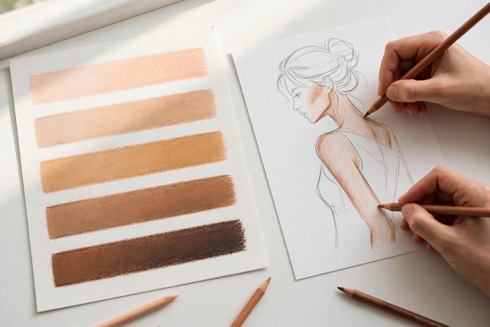
Start with the lightest layer. For light skin, lay down a pale peach or light beige with gentle, even pressure. For medium skin, start with a warm tan. For deep skin, start with a golden brown rather than jumping straight to the darkest pencil in your set. Keep your strokes in one direction and stay inside the lines — a smooth base makes everything that follows look better.
Next, add the shadow layer. Shadows fall under the chin, along the sides of the nose, beneath the arms, behind the knees, and wherever fabric overlaps the body. Use a slightly darker, warmer version of your base color — a burnt sienna or warm brown — and press a little harder. Blend the edge of each shadow back into the base tone with light circular strokes so there is no hard line.
Finally, add life. A whisper of pink or coral on the cheeks, nose, and fingertips makes skin look alive instead of flat. Leave the brightest highlights untouched: the bridge of the nose, the tops of the cheekbones, the center of the forehead, and the shine on the lower lip. White paper is your brightest highlight, so plan for it instead of coloring everything in and trying to erase later.
Undertones: Warm, Cool, and Neutral
Undertones are what make skin tones look believable across light, medium, and deep complexions. Warm undertones lean golden, peachy, or honey-colored. Cool undertones lean pink, rosy, or slightly plum. When you color a fashion model, pick one undertone family and stay consistent across the face, arms, and legs — mixing a peachy face with a gray-toned arm is what makes a figure look off.
A practical trick: layer a warm base with a cool shadow, or a cool base with a warm blush. This contrast mimics real skin, where blood flow and shadow create subtle temperature shifts. Practice on your scrap sheet by coloring five swatches from very light to deep with the same three-layer method, and you will quickly learn which pencil combinations suit each range.
Blush, Lips, and Eyes
Blush should be the softest color on the page. Use a light pink or coral with barely any pressure, and build it up slowly — you can always add more, but you cannot easily take it away. Lips look best in two tones: a medium rose or berry for the main lip color, with a darker line where the lips meet and a tiny untouched highlight on the lower lip. For eyes, keep it simple: a soft brown or gray for lashes and brows, a touch of color on the lids if the look calls for it, and a tiny white dot for the sparkle in each eye.
Step 2: Fabric Shading — Denim, Silk, Knit, and Leather
Clothing is the star of a fashion coloring page, and different fabrics need different shading to look real. The trick is to study how each fabric behaves: where it folds, where it shines, and where it stays matte.
Denim: Casual and Textured
Denim is one of the easiest fabrics to color convincingly. Start with a medium blue, then add a darker blue in the folds and seams — around pockets, cuffs, and knees. Leave narrow lighter streaks where the fabric stretches, such as across the thigh of jeans or the elbow of a jacket. A white or very pale blue pencil, used lightly over the top, mimics the faded, worn look of real denim. For more practice with smooth gradients, our tutorial on how to blend and shade flower coloring pages teaches the same layering skills that make denim look soft and realistic.
Silk and Satin: Smooth Shine
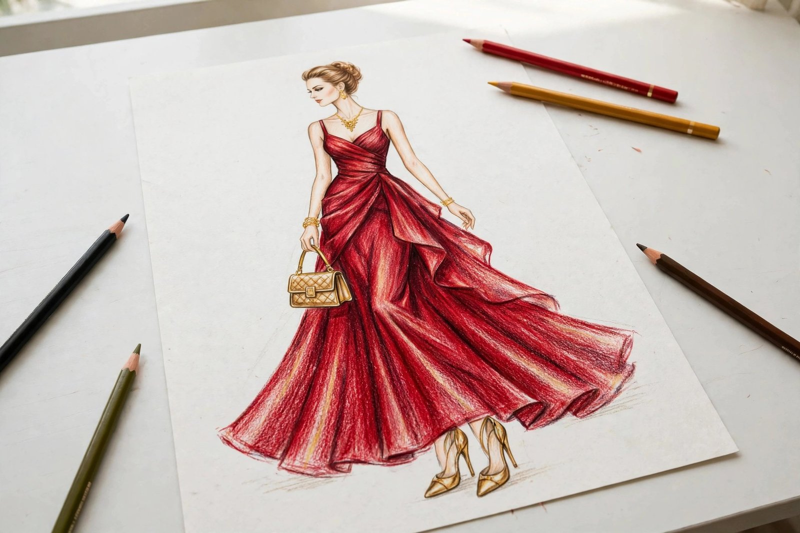
Silk and satin are all about contrast: bright highlights right next to deep shadows, with very little in between. Color the main area in your chosen shade, then press firmly in the shadowed folds with a darker version of the same color, and leave bold white or near-white stripes for the shine. The shine should follow the direction of the fabric's drape — long vertical highlights on a gown skirt, curved highlights on a draped sleeve. Avoid over-blending silk; the highlight-shadow contrast is what sells the luxury.
Knit: Cozy Texture
Sweaters, scarves, and knit dresses need texture more than shine. Color the base tone evenly, then add short, slightly darker dashes or tiny V shapes to suggest stitches. Keep the marks small and consistent — too large and they look like a pattern, too sparse and the knit reads as flat fabric. Cozy knits also take shadow softly, so blend your darker tones gently rather than pressing hard.
Leather: Rich and Glossy
Leather jackets, boots, and handbags need a deep, rich base with a sharp highlight. Start with a dark brown or black, then add a medium brown layer on the raised areas, and finish with a narrow, bright highlight along edges and folds. Unlike silk, leather's highlight is tighter and more focused — a thin gleam rather than a broad shine. A touch of warm brown in the highlight keeps black leather from looking gray and lifeless.
Step 3: Patterns — Stripes, Florals, and Plaid
Patterns are where fashion coloring gets really fun, and they are easier than they look if you work in order: base color first, pattern second, shading last.
Stripes
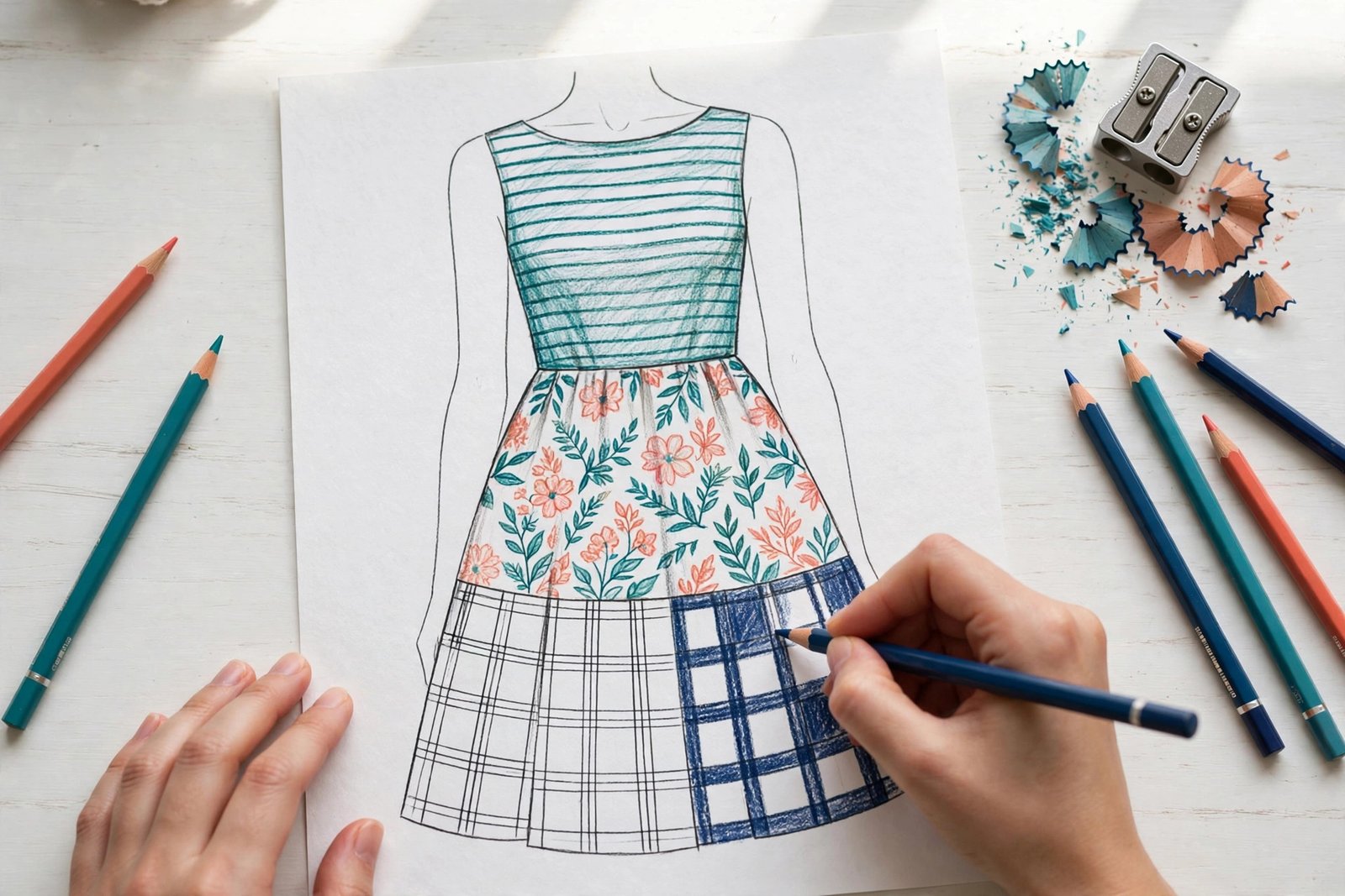
For stripes, color the entire garment in the lighter stripe color first. Then add the darker stripes, following the body's curves so the stripes bend with the fabric rather than cutting across it. Keep stripe widths consistent, and remember that stripes get slightly narrower where fabric folds inward.
Florals
Floral patterns work best when you limit yourself to two or three flower colors plus one leaf green. Color all the flowers in one color first, then the second color, then the leaves — working color by color keeps the pattern tidy and prevents muddy overlaps. Leave tiny white gaps between petals for a fresh, airy feel, and add a darker green shadow on one side of each leaf cluster to give the pattern depth.
Plaid
Plaid looks complex but follows a simple grid. Color the whole garment in the lightest plaid color, then draw the vertical bands, then the horizontal bands, pressing lightly. Where bands cross, press harder or layer the second color to create the darker woven squares that make plaid recognizable. Classic combinations include navy and white, red and black, or camel and cream.
Step 4: Hair and Accessories
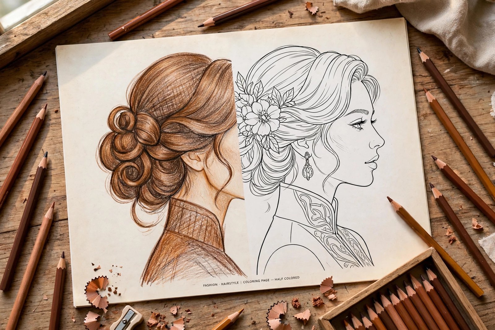
Hair frames the whole illustration, so it deserves the same layering approach as skin. Start with a mid-tone base — not the darkest shade — then add darker strands in the shadowed areas underneath and behind, and finish with a few lighter strands on top where light catches the hair. For blonde hair, use yellows and light golds with a touch of light brown in the shadows. For brown hair, layer golden brown over dark brown. For black hair, use dark brown and charcoal with a hint of blue or purple in the highlights instead of flat black, which can look dull.
Accessories are the jewelry of your page, and they are where metallic pencils earn their keep. Gold jewelry pops with a yellow base, a warm brown shadow, and a white highlight dot. Silver needs a cool gray base with a darker gray shadow and the same bright highlight. Handbags deserve fabric logic too: a quilted bag gets a diamond grid of light shadows, a suede bag stays matte with soft shading, and a patent bag gets one sharp highlight like leather.
Common Mistakes (and Easy Fixes)
Even experienced colorists slip up on fashion pages. Here are the mistakes we see most often, and how to avoid them.
- Pressing too hard too soon. Heavy pressure in the first layer fills the paper's tooth, so later layers cannot grip. Start light, build slowly, and save firm pressure for final shadows.
- Using only one pencil per area. A dress colored in a single flat red looks like a sticker. Every area needs at least two tones: a base and a shadow, plus a highlight where light hits.
- Coloring skin in a single flat tone. Real skin has warm and cool shifts. Add blush, shadow, and highlight, even on small figures.
- Ignoring the light source. Pick one direction for your light — usually upper left or upper right — and keep every shadow on the opposite side. Mixed lighting is the fastest way to make a page look wrong.
- Overworking patterns. When stripes or plaid start to look muddy, stop. Let the page rest, then add only the darkest accents. Less is often more with patterns.
- Forgetting the background. A page with a fully colored outfit and a blank background can feel unfinished. A soft wash of pale color, a few simple shapes, or even a light gray shadow under the model's feet grounds the whole illustration.
Step 5: Finishing Touches That Make a Page Look Professional
When the main coloring is done, step back and look at the page from arm's length. Check three things: does one color dominate the way you intended, do the shadows all fall on the same side, and is there at least one bright highlight on the outfit, the skin, and the accessories? Fix the weakest of the three before you call the page done.
A final pass with a white pencil can soften harsh edges and blend pencil strokes into a smoother finish. A colorless blender pencil does the same job without adding pigment. If you plan to display the page, a light coat of workable fixative keeps pencil from smudging — spray outdoors or in a ventilated room, and let it dry completely before stacking pages.
Start Coloring Your Own Fashion Collection
Learning how to color fashion illustrations is a skill that grows with every page: smoother skin tones, more believable fabrics, bolder patterns, and accessories that shine. The best way to improve is simply to color often, try one new technique per page, and keep a scrap sheet handy for experiments. Before long, you will have a personal collection of outfits that reflect your own style — from classic black-and-white evening looks to bright summer palettes and cozy knit ensembles.
Ready to practice? Pick up the Fashion Coloring Book for Adults and try the skin tone method on your first page, then the fabric shading techniques on the next. For even more fashion-inspired illustrations, dresses, accessories, and creative designs, visit Zira Vale's Amazon author page and find your next favorite coloring book. Happy coloring!

0 Comments