
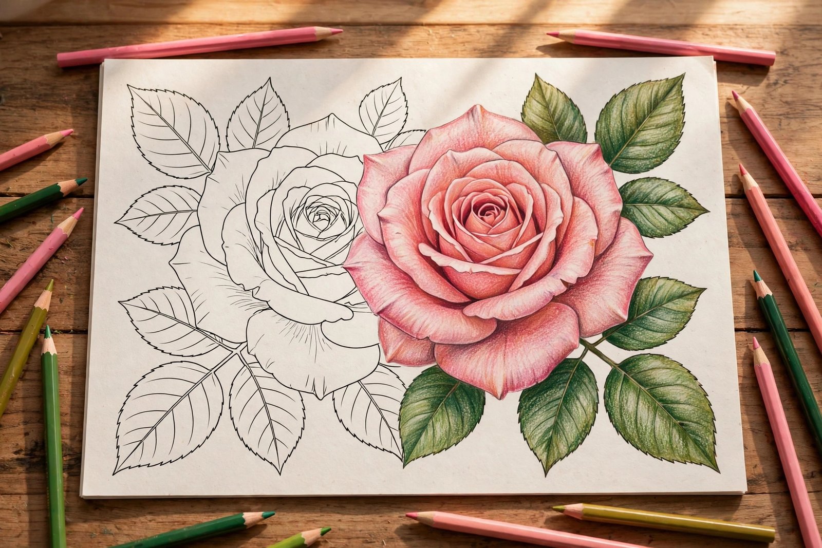
There is a moment every coloring enthusiast remembers: the first time a flat, filled-in petal suddenly looks round — like you could reach out and touch it. That transformation comes from two skills working together: blending and shading. Learning how to blend and shade flower coloring pages is what separates a pleasant coloring session from a genuinely stunning finished page.
The good news? These techniques are far easier than they look. With the right approach — and the right pages to practice on — you can go from flat color to dimensional, glowing blooms in a single evening. Botanical designs are the ideal training ground: petals are forgiving shapes that reward layering, and nature gives you endless color inspiration. Unhurried Botanicals by Zira Vale was made for exactly this kind of practice — 40 unique botanical designs with easy-to-medium detail, from graceful flowers and leafy plants to succulents and peaceful garden scenes, all on single-sided pages that welcome heavy layering.
In this guide, we will walk through petal blending and shading step by step: the tools, the techniques, the common mistakes, and a practice plan that builds your skills page by page.
Why Flowers Are the Best Pages for Learning to Blend
Not all coloring subjects are equal when it comes to learning technique. Mandalas are beautiful, but their tiny repeating segments punish uneven blending. Animals have fur, which is its own skill. Flowers, though, are wonderfully forgiving:
- Petals are large, smooth shapes — plenty of room to practice gradients without fiddly edges.
- Nature already blends. Real petals fade from deep color at the base to pale tips, so your gradients look “right” even when imperfect.
- Mistakes hide well. An uneven blend on a rose reads as natural variegation; the same mistake on a geometric pattern screams.
That is why experienced colorists so often recommend starting a technique journey with botanical pages. A book like Unhurried Botanicals — with its mix of larger floral compositions and simpler succulent pages — lets you choose your difficulty: a big dahlia for a long blending session, a quick succulent when you only have twenty minutes.
The Tools You Actually Need
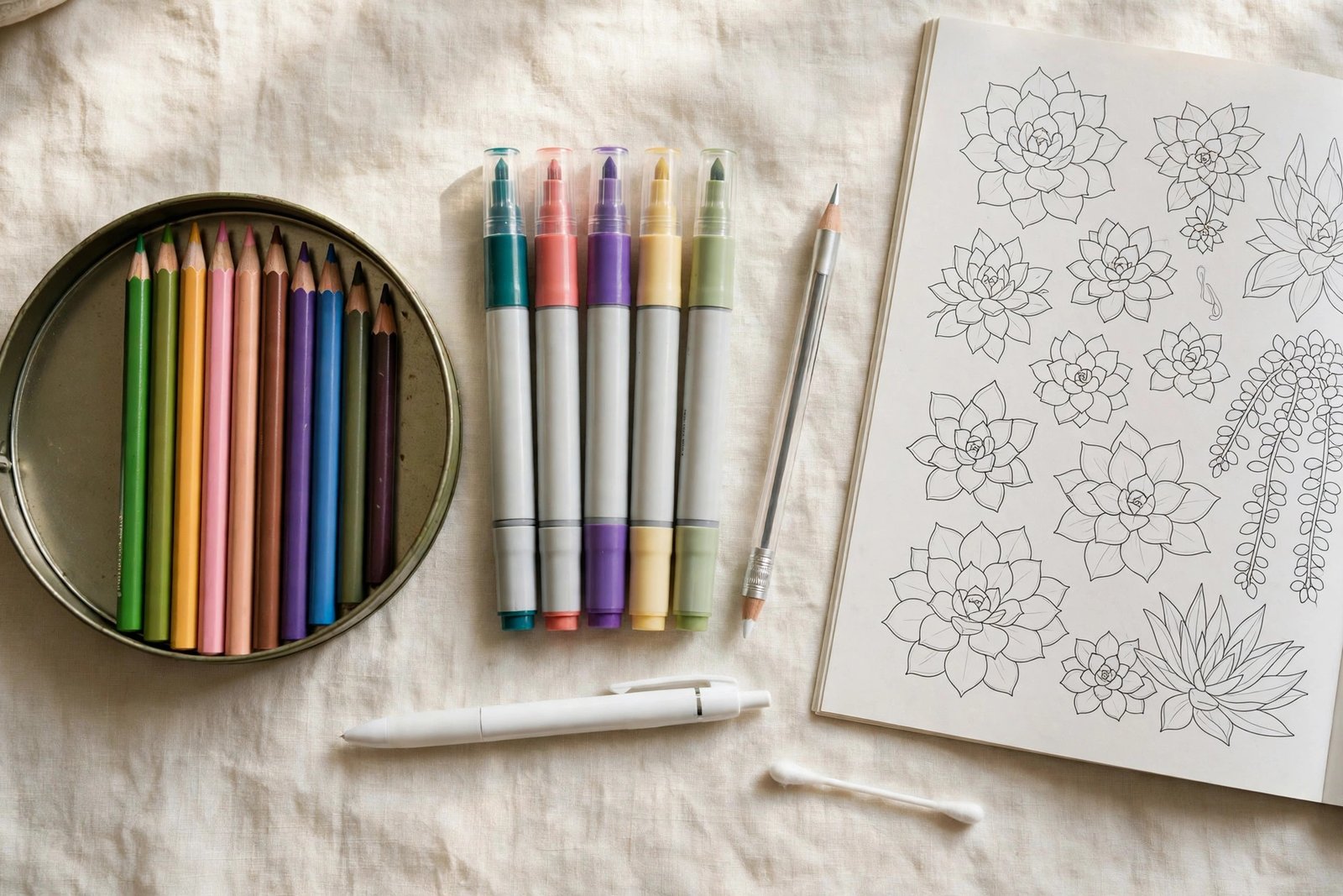
You do not need a $200 pencil set to blend beautifully. Here is what matters:
- Colored pencils (wax- or oil-based): the workhorse of blending. Wax-based pencils layer smoothly; oil-based pencils hold a sharp point longer. Either works — use what you own.
- A colorless blender pencil: this inexpensive tool melts pencil layers together without adding color. It is the closest thing to a magic wand in coloring.
- White pencil: for softening transitions and adding a luminous quality to light areas.
- White gel pen: for final highlights — dewdrops, petal-edge glints, tiny details that make a page pop.
- Optional: odorless mineral spirits with a paper stump. A tiny amount dissolves wax layers into a painterly wash. Use sparingly, with ventilation — and test on scrap paper first.
Alcohol markers can also blend beautifully, but they demand faster work and thicker paper. For most adults learning to shade, pencils offer more control and more forgiveness — and a sharp pencil point reaches the tight corners of botanical line art that marker nibs cannot.
Step 1: Map Your Light Source
Before you color a single petal, decide where the light is coming from. This one decision drives every shading choice you will make. Pick a direction — top-left is the classic — and keep it consistent across the whole page.
Then, for each flower, identify:
- The lit side (facing your light source): lightest colors, brightest highlights.
- The turned-away side: mid-tones deepening into shadow.
- Overlap shadows: wherever one petal tucks behind another, a soft shadow lives there. These small shadows create most of the page’s depth.
Lightly mark your light direction in a page corner with a tiny arrow in pencil — you can erase it later. Beginners who skip this step end up with shadows pointing every which way, and the flower never quite looks solid.
Step 2: Lay Down a Light Base Layer
Start with your lightest color and cover the whole petal using light, even pressure and small circular strokes. This base layer does two jobs: it establishes the petal’s overall hue and gives later layers something to grip.
Resist the urge to press hard. Heavy pressure in the first layer flattens the paper’s tooth — the tiny texture that holds pigment — and makes later blending nearly impossible. Think of it as whispering the color on, not shouting it.
Step 3: Build the Gradient — Dark to Light
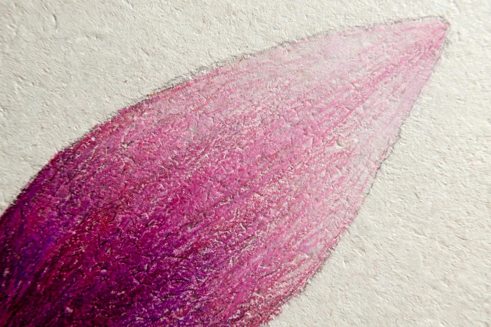
Now the blending itself. Working from the petal’s base (usually the darkest part, near the flower’s center) toward the tip:
- Apply your mid-tone color over the base two-thirds of the petal, overlapping the light base.
- Apply your darkest shade over the base one-third, overlapping the mid-tone.
- Go back over each transition zone with the lighter of the two colors, using slightly firmer pressure and small circles. This is where the magic happens — the colors melt into each other.
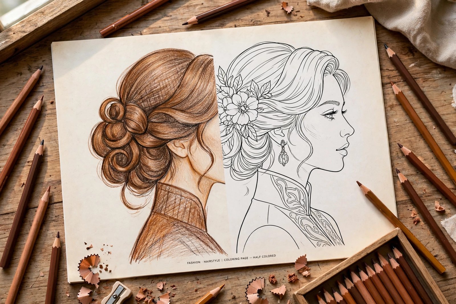
- Finish by running a colorless blender pencil (or white pencil for a softer look) over the transitions.
The classic natural pattern — dark at the base, light at the tip — mirrors how real flowers catch sunlight. But do not feel locked in: a reverse gradient (pale base, vivid tip) creates a striking, modern look on pages like dahlias and zinnias.
Step 4: Shade the Overlaps and Curls
With your gradients in place, deepen the shadows where petals overlap or curl under. Use a darker value of your base color — or, for richer shadows, a touch of the base color’s complement (a whisper of violet in yellow petals, for instance). Build these shadows gradually in two or three light layers rather than one heavy pass.
Pay special attention to:
- Where petals disappear behind others — the deepest shadow on the page.
- Curled petal edges — the underside of a curl is always in shadow.
- The flower’s center — depth here makes the whole bloom feel three-dimensional.
Step 5: Add Highlights That Make Petals Glow
Highlights are the finishing touch that makes people say “wow.” Once your blending and shading are done:
- Leave (or reclaim with an eraser) a soft highlight on the lit side of each major petal.
- Add a thin white gel-pen line along one curled edge to suggest a rim of light.
- Dot tiny gel-pen highlights for dewdrops — three small dots clustered together read instantly as water.
Less is more. A page with three confident highlights looks more professional than one with thirty tentative ones.
Blending With Markers: A Quick Primer
If you prefer alcohol markers, the rhythm changes: work fast while ink is wet. Lay the light color first, then add the darker color slightly overlapping, and use the light marker’s tip to gently scrub the seam, pulling dark into light. A colorless blender marker extends your working time. Note that markers demand single-sided pages — one more reason a book printed single-sided, like Unhurried Botanicals, earns its place on your shelf.
5 Mistakes That Ruin Blends (and How to Fix Them)
Every colorist makes these mistakes — the difference between a beginner and an experienced hand is simply knowing the fixes. Run through this list before you start each page, and you will sidestep the errors that make blends look muddy or flat.
- Pressing too hard, too early. Fix: keep early layers feather-light; you can always add pressure, but you cannot take it back.
- Skipping the transition zone. A hard line between two colors is the #1 beginner tell. Fix: always overlap colors and re-work the seam with the lighter color.
- Using black for shadows. Black deadens color. Fix: shade with darker values of the base hue or complementary colors.
- Inconsistent light source. Fix: mark your light direction before you start and check it every few petals.
- Coloring every petal identically. Real flowers vary. Fix: shift the gradient’s position slightly from petal to petal — nature is gloriously inconsistent.
Color Combinations That Always Work
Choosing colors is half the battle. These tried-and-true trios (light → mid → dark) flatter almost any flower:
- Classic rose: pale pink → rose → deep magenta, with olive-green leaves.
- Sunflower: buttery yellow → goldenrod → burnt orange center, with sage leaves.
- Lavender: lilac → medium purple → deep violet, with gray-green stems.
- White blooms (daisy, lily): white paper → pale gray → cool blue-gray shadows. White flowers are shaded, not colored — a wonderful advanced exercise.
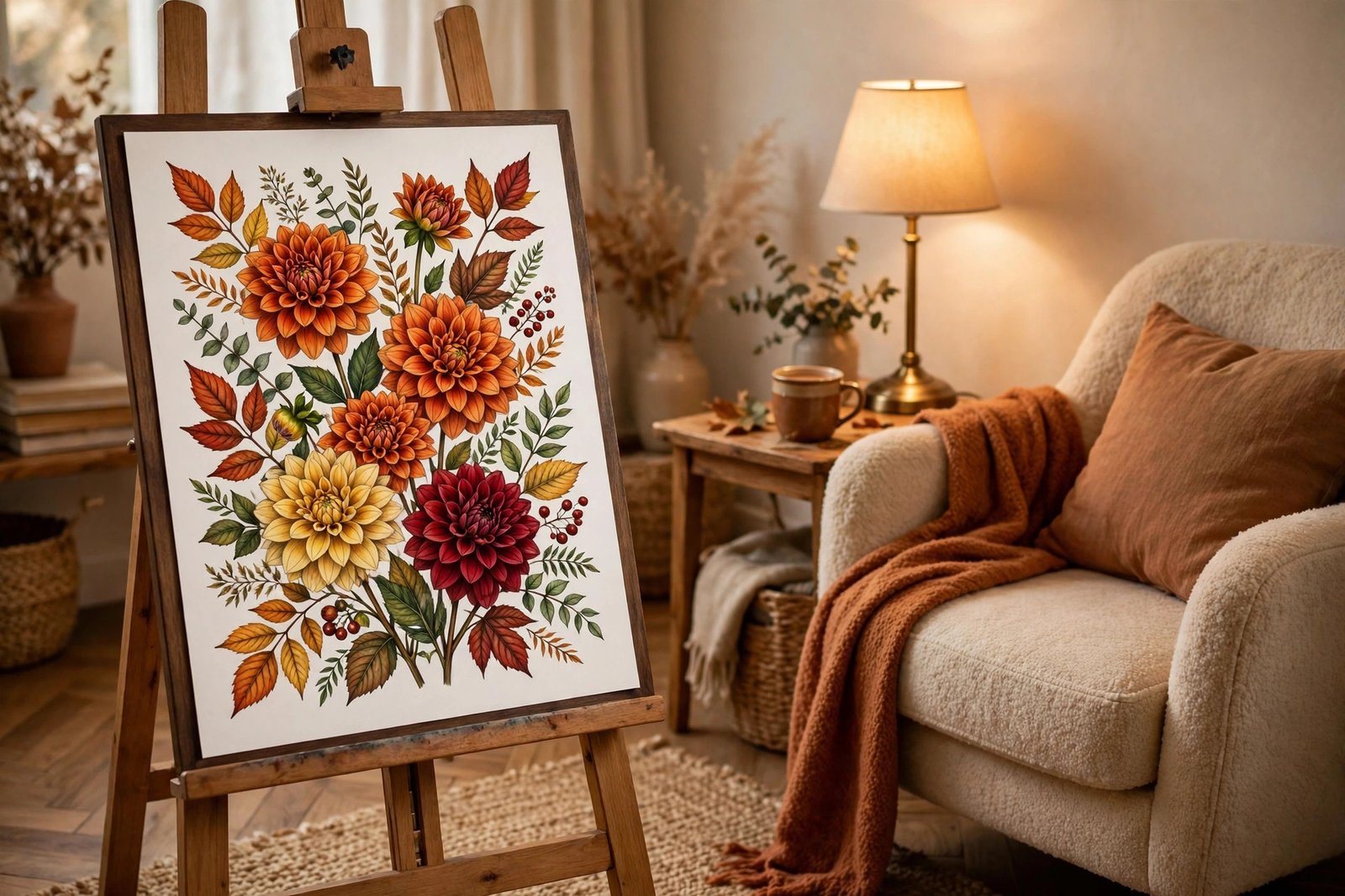
- Moody dahlia: coral → crimson → near-black burgundy for dramatic, gallery-worthy pages.
Keep a small swatch card: color your three chosen pencils in gradient bars on scrap paper before committing to the page. It takes thirty seconds and prevents the heartbreak of a combination that looked better in your head.
Paper Matters More Than You Think
Blending lives or dies on paper. Thin, smooth paper saturates quickly and pills under layering; paper with a bit of tooth holds multiple layers gracefully. This is the practical reason experienced colorists prefer books printed on sturdy, single-sided stock — you can layer aggressively, test markers on the back, and never worry about ruining the next design. The same layering fundamentals apply across subjects — our step-by-step mandala coloring guide covers pressure control and stroke technique that transfers directly to petals.
If your book’s paper is on the thinner side, adapt: favor lighter pressure with more layers, skip the mineral-spirits technique, and keep markers for other projects. Technique should flex to your materials, not fight them.
Your 4-Week Blending Practice Plan
Week 1 — Single-color gradients: pick one hue and practice dark-to-light gradients on simple succulent or leaf pages. Master pressure control.
Week 2 — Two-color blends: blend analogous colors (pink into orange, blue into violet) on medium-size petals. Focus on seamless transition zones.
Week 3 — Full flowers with shadows: tackle a large floral composition — map the light source, shade the overlaps, add gel-pen highlights.
Week 4 — Creative color: abandon realism. Try a teal rose or a purple sunflower. Unconventional palettes teach you that technique, not color choice, carries the page.
A 40-design book gives you ten pages per week with room to spare — which is exactly the kind of runway Unhurried Botanicals provides, with its easy-to-medium detail that never punishes a learner. And when you want a seasonal change of pace, our cozy Halloween coloring guide applies the same blending principles to autumn scenes.
The Bottom Line
Blending and shading are not talents — they are procedures. Light base, layered gradient, deepened shadows, confident highlights. Practice that sequence on forgiving flower pages, and within weeks your coloring will have a depth you did not think your hands could produce. Keep your early pages, too — flipping back through them in a month is the most motivating progress tracker a colorist can own.
Ready to start? Get Unhurried Botanicals on Amazon — 40 botanical designs made for exactly this journey — and explore more coloring books by Zira Vale when you are ready for your next challenge.
0 Comments